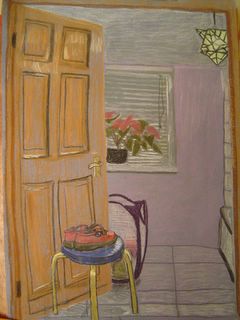
Last picture in the pastels section of my drawing in colour course

My tutor's comments: Yes, the door is obviously a bit out but I like the way you have used a cultured ground in this picture. I also particularly like the lampshade, which I think owes its success to the fact that it is yellow. Yellow being complementary to the purple ground of the picture gives the effect of making it stand out. This particular complementary contrast of yellow and purple has the property of also making the most contrast of tone, which also has the effect of making the yellow appear to glow against the background.
1 comment:
I really like your choice of colors here. The yellow, red and to some extent, the purple, give positive energy and cheeriness to an otherwise "ordinary" subject matter. Your use of angles for the 3-D look is improving.
Post a Comment