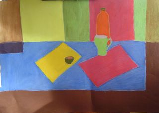
My first picture for my drawing in colour course.

I didn't like this picture. In my notes to my tutor I said I didn't like it because it didn't look right. Because my aim (and the objectives laid out in the assignment) were to try to describe what I was seeing as accurately as possible, I didn't feel the flatness of it was accurate, nor the tones of the colour of the objects or the blocks. However, my tutor's comments surprised me. It seems I am learning more from the drawings I thought were crap and didn't like than the ones that I did. For a start, it never even occurred to me to think in any other way than trying to describe what I saw accurately. Seems a bit obvious now, but as a beginner, I thought that to try to achieve accuracy or a good likeness was enough to aim for. In any case, it's given me a lot to explore and think about, especially what artists try to express / convey / achieve in their art. Any comments, books, artworks, articles, drawing experiments to try that might help me in my exploration would be most appreciated.
My tutor's comments: You commented that you were not pleased with this drawing because it appeared too flat and various things about it were not right. I am always interested in the statement "not right" in reference to a drawing or a work of art because it presupposes an absolute or an ideal of rightness which is potentially different for each artist. It may be useful for you to consider what it means for you for an artwork to be right. To me this drawing makes reference to many other modernist artists for whom the ideal of rightness or particular style was very much bound up in abstract ideas about colour. Artists such as Nicolas de Stijil or Piet Mondrian - particularly Mondrian because of the way that he makes use of the vertical and horizontal as you have here.
1 comment:
I definitely noticed a distinct lack of "3-D" to the picture, or as you described it "flat." However, the drawing was quite stunning in its simplicity and color. It looks like something either a world-renowned artist or a kid would draw, which quite honestly, is great because art is all in how one defines it for themselves.
Post a Comment