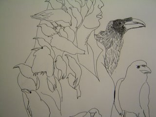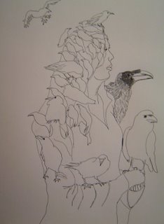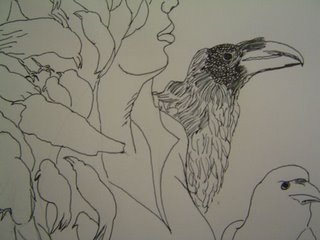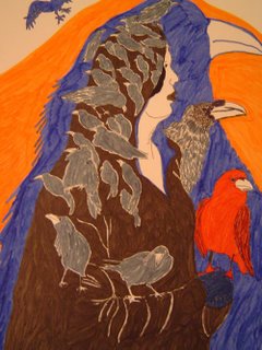
"Keeper of Souls..."
She walked with the ghosts of a thousand crows...
This was the idea that instantly popped into my head as soon as I saw the word "ghost". Not sure why exactly. I know that crows can have negative connotations for a lot of people, but I actually like them.


I'm not sure which version I prefer, the pen & ink or the colour.
What do you think?

Thank you everyone for your generous comments. I think that for this topic, I preferred the pen and ink too which is probably why I posted so many versions of it here. However, I do like the grey and red contrasts of the colour version, but not so much for this topic.
43 comments:
interesting work!
I realy prefer a lot more the version in pen and ink.
lovely drawing! love the birds!
Both versions are wonderful. Great illo!
Wow, both are great and look very ghostly. I love both, but I prefer the colored one. To me the one with colors looks more powerful. The red bird on the hand and the blue one in the background make a great contrast and add drama to it.
Great illustration!
Thanks for sharing all the different views here. All are great but I really like the line drawings most.
Very cool. i prefer the pen and ink...more mysterious.
What a beautiful ghostly character. We have a billion crows up here in Seattle. I love the idea of their being a woman that takes care of their souls. Nice work.
wow, quite freaky, in a good way of course! all those crows! love it, where did the idea come from? i may not be the most impartial to comment as i am in a big ink-passion phase at the mo, but i personally prefer the ink line version of the two, it seems a much stronger image. great work!
I really love your sign and the dark feel emerging out of your drawing.
They're both wonderful but I think I prefer the color version as it adds another dimension. I really like the bit of a crow at the very top. I kind of like crows too, especially in the city--any wildlife is good.
They're both wonderful because the drawing is so strong and the image is so dramatic! Spooky!
Wonderful job Tammy. I love them all but prefer the pen and ink, which is surprising to me because I usually prefer color. I just like these lines.
this is my favorite so far? Did I say that before?
fabulous!
i much prefer the straight line drawing.
if you were to use colour i think something that provided really flat colour would be most appropriate (gouache/screen print/scanning the illo and colouring in Illustrator/Photoshop). I think the markers have too much texture, and detract from the clarity of the work.
a.
Sounds like a poem: she walked with the ghosts of a thousand crows. That's great! I think the starkness of the pen and ink works best.
Pen and ink is better, it is like a ghostly picture a shadow world rather than one filled with sunlight and colours, stark but strikingly impactful, lovely
Really great job. This is what I like to see more of...the start of a project as it slowly comes to life. Great Job!!!
Mike
Nice illos...but I think in this case the B + W is stronger, more ghostly. Okay, here's the funny thing. Doing ravens was my first idea but I haven't had a chance to do them so I did a quick sketch of the ocean instead. I love that you did this! Nice job! Oh, and I believe crows/ravens are mystical, magical creatures.
Stunning work here! Love both the pen and ink and the coloured one. But if I were forced to make a choice I would say pen and ink.
i really the the drawing. especially how you cropped it in the first picture.
Ooh! Tough choice, but I think the ink outlines work best! I think it makes your brain work harder..you know... doesn't give everything away at once. I love your kitty paintings too. hurrah for felines!
Both versions are interesting. Though of the two, I prefer the line drawing the most. The line drawing embodies a more abstract feel and creates amazing dynamics between the "simple" shapes. The colored one is very eye-catching with the contrasting colors, and has a lot of warmth, which I think works against the "ghost" theme, but creates a nice illustration regardless.
i like the pen and ink. it has a transparency that is appropriate to the mystery of the image.
It's all good but I like the pen and ink. I agree, crows aren't all bad, though they haven't been blessed with the most musical call.
i like your ghost illustration.. i'm still working on mine.
(off topic)
if you dont mind me asking what do you do ? for your career? do you enjoy it? have you ever thought about a different career?
I like bother versions, but the pen and ink is so much more suitabe for the subject. The crows are beautifully rendered, and the little slice of her face adds such an air of mystery. Lovely!
wonderful,lovely birds I very like crows because I see them every day and they meet me...:o)
Best Wishes
Issi
Awesome drawings, I would favour the pen and ink for the topic, as others said, more mystery.
Beautiful mood you have in this piece. I especially love the color.
Well, I guess I've been questioning my career as a Graphic Design Major.
See I LOVE doing this stuff (graphic design) on my own time and pace, but when it comes to school work, I don't love it. I don't know why. I've been thinking perhaps I'm just tired of school you know? I guess the campus makes things worse and also the people around me.
It seems like I've been practicing my whole life and I'm tired of it. I just want to play the real game. Some people say "Practice makes perfect," but the thing is.. you can only learn so much from practicing. All of the real lessons are learned while playing the game and it's more impactful because the penalties of making a mistake in real life is so harsh that you can't help but learn from the mistake and come back a better and more smarter individual.
I'm a pen and ink kinda gal myself. I believe in leaving something to the imagination! God forbid we actually use our imagination this day in age! LOL!!
BTW, LOVE your work!
Nice work. Both versions are terrific!
I have to go with the pen and ink one... though both are very good... the ghost theme seems to come across more hauntingly in ink... and yeah, crows are cool.
Very cool idea! I personally like the colored the best, just because I like the background and the red one really catches my eye. I love the choices you made on colors. Very earthy feel to it.
...have you decided which one you prefer yet? let us know if you decide, along with why! hugs :)
this is a very creative take on the topic. I love them both, but the first pen and ink the most. I like the simplicity, with just one detailed bird. Great composition
Very nice ! I definitely prefer the inked version !
Nice illo, love the design concept!
Verycreative idea for 'ghost'. I like the pen and ink-it has the point of view of the crows-the ghost a little more-stark, abstract look to it. The color version though is my favorite, just for the shear beauty of the colors and bringing out the design. Great take and love the artwork!
Haunting image!
You work has personality. I like it. Thanks for the visit.
really really really amazing. i love the pen and ink. would buy a tee shirt of it! or a print even. very cool.
Stunning - just absolutely stunning!! Wow just so beautiful.
Post a Comment