Sunday, February 19, 2006

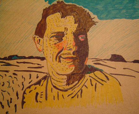
Song part 2 for Illustration Friday


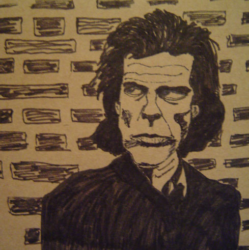
Not content with my freakish baby drawing, I decided to draw one of my favourite songwriters & singers, Nick Cave. This was drawn from the album cover of The Boatman's Call. When I listen to his music I feel darkly luminescent, electric. Not sure this drawing captures that at all, but here it is anyway. Posted by Picasa

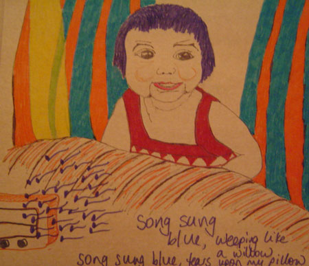
Freaky Baby - Song Part 1 for Illustration Friday


It was hard figuring out what to draw for this week's challenge. Song conjured up so many images, song birds, bird song, songs from my childhood, songs that saw me through dark times. Anyway, I realised that I spent a lot of time listening to music in the backseats of cars on long journeys with my parents, so I decided to draw this.

It's drawn from a photo of me as a baby in the back seat of my parents' orange Fiat. Music was a big part of my childhood, we always had music on and I remember being crooned to by Bing Crosby to Elvis, Johnny Mathis to Johnny Cash, Neil Diamond to Peter, Paul & Mary. One of the first songs I learned to sing was the Neil Diamond song, Song Sung Blue, hence the blueness of this drawing. I'm not sure how I feel about this picture. It's a little freakish, but what the hell...someone might actually like it. Posted by Picasa

Friday, February 17, 2006

Everyday matters - Someone I love


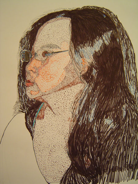
The everyday matters challenge this week gives me a chance to have another try at drawing Paul. It's an improvement I think, even though he doesn't really have that moustache I gave him!

Drawn with marker pens 16.2.06 Posted by Picasa

Wednesday, February 15, 2006

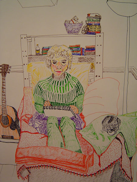
Friend in my living room


This is part of a drawing done for my drawing in colour course, of a figure portrait in a room. All done in fine nibbed ink pens. 15.2.06 Posted by Picasa

Sunday, February 12, 2006

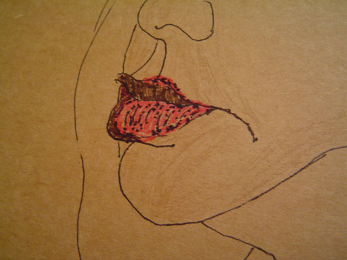
Everyday matters - MOUTH


This is my mouth. It's closed. It's not often closed, except in pubs with large groups of people I don't know, who always comment, "So, you're quiet." That's because they haven't been with me first thing in the morning, ranting at the news as I try to get myself psyched up for work, where I spend many more hours keeping my mouth shut.

My mum once told me I had the perfect mouth. But she also told me not to use it to talk back to her. Posted by Picasa

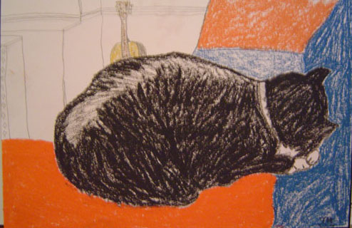
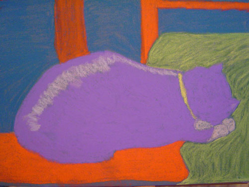
Cat nap


Another version of this drawing, in charcoal, pastel and pencil 12.2.06 Posted by Picasa
Caesar sleeps on his blanket on the sofa.

Illustration Friday SIMPLE


Cat nap, pastel 12.2.06 Posted by Picasa

There isn't much in life that's simpler than a cat taking a nap.

Friday, February 10, 2006

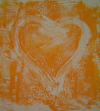
Threaded heart monoprint


This is a print inspired by a token left by a parent to identify her child, on display at The Foundling Museum. The token itself is no more than 4 inches square, a piece of cloth sewn into cardboard, with little wires adorning it. Posted by Picasa

Drawing at The Foundling Museum


10 minute sketch from a painting in the museum 10.2.06
"Feeling the pinch of poverty" by Thomas Kennington Posted by Picasa

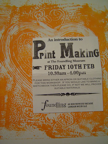
The Foundling Museum tells the story of the Foundling Hospital, London's first home for abandoned children and of three major figures in British History: its campaigning founder the philanthropist Thomas Coram, the artist William Hogarth and the composer George Frideric Handel. It was also Britain's first public art gallery. I spent the day there today at a printmaking workshop.

There follows photos of the drawings I made based on the museum's exhibit, and the prints that were inspired by those drawings.

Printmaking workshop at The Foundling Museum


This is what I did today. Posted by Picasa Friday 10.2.06

Fourteen members of the public signed up for this workshop at The Foundling Museum in London. Interestingly, we were all women, with varying backgrounds in art. Our tutors were Zoe Image and Janet Wolchover from Richmond Prints. We spent the day drawing in the museum and then making prints using two simple techniques - monoprinting and blockprinting, from polystyrene blocks.
We printed using water based poster type paints.

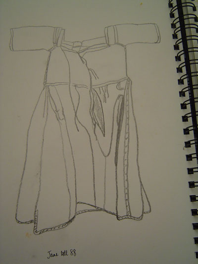
Drawing of a foundling child's dress


This tiny cotton dress was in one of the exhibits, embroidered with the name Jane Bell 88 at the waist. I used this drawing as a basis for making various prints later. Posted by Picasa

Tokens left by the foundlings' mothers


When mothers left their children at The Foundling Hospital, they also left a small token with which to identify their child. This was used as proof that a mother had left her child at the hospital, rather than having abandoned or killed it. Or, if circumstances changed and families were able to come back to claim their child, the token was used as a means of identification to connect the child with its mother. Children left at the hospital all had to be under one year old so they would have no memory of their parents.

Tokens varied from coins to crosses, beaded bracelets and necklaces, and other pieces of jewellery from the simple to the more precious. There were many items that were heart shaped, and a number of tiny locks and keys. There was one item (which I have drawn) which was a piece of wire shaped like a small ring, with little circles twisted into its circumference. As the children were never told who their real parents were, they never got to see the tokens their mothers had left. Posted by Picasa

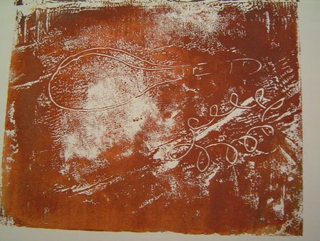
Tiny tokens monoprint


This is a monoprint inspired by a couple of the tokens on display in the museum. Here they are much enlarged in size. I like the unpredictability of making a monoprint. This was done by rolling paint onto a plastic sheet, drawing the design directly onto the paint with the end of a paint brush, and then placing a piece of cartridge paper over it. The result varies according to the amount of paint you use, the pressure with which you press it down, etc. Each print is unique, and you can only make one print at a time using this method, hence the term monoprint. Posted by Picasa

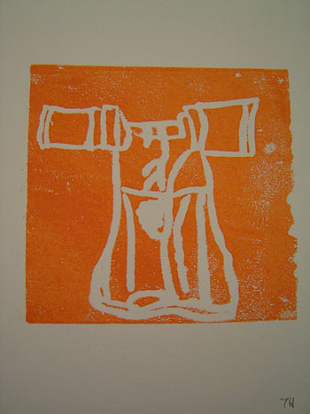
Blockprint of child's dress with dots


This is a block print based on my drawing of a child's dress. The design of the dress was drawn and then pressed into a piece of polystyrene (the block). Paint was applied to its surface and then a piece of cartridge paper pressed onto it. The design comes out back to front, which I hadn't taken into account when I drew it, and made for interesting results! Posted by Picasa

Blockprint of child's dress


A simpler blockprint, from the design of a child's dress, before I added the dots to the template. Posted by Picasa

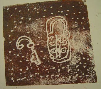
Lock & key blockprint


As you can see, the key came out back to front. Posted by Picasa

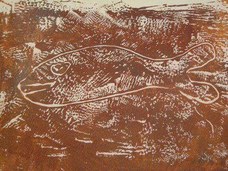
Groovy fish monoprint


This was the happiest of accidents. I was using up the last of my paint and drew this very quickly on a plastic sheet and not very carefully pressed my paper on top. This was the result. I love the textures that came out purely by accident, and the detail in the fish's eye. This drawing is based on one of the tokens on display, a tiny mother of pearl fish. Posted by Picasa

Sunday, February 05, 2006

Another dog sketch


Just remembered I did this sketch back in October, also based on a photo taken by my friend Sarah of a dog we saw in a cafe in St Ives. He was sitting under a table by a window and his head was poking out from under the tablecloth and resting on the windowsill. Posted by Picasa

Saturday, February 04, 2006

Second attempt at self-portrait in ink


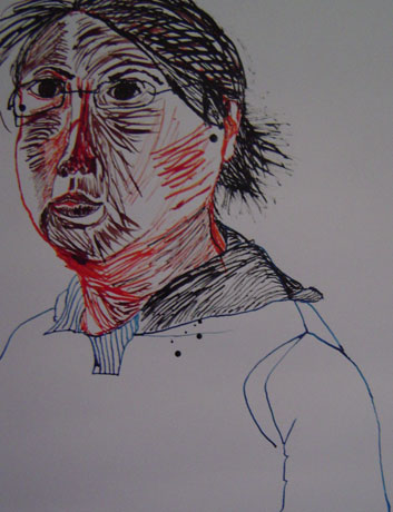
Second attempt at a self-portrait in ink 4.2.06 Posted by Picasa
Again for my drawing in colour course

Those of you who know me might actually recognise me in this one. In attempting this version, I went with the philosphy of "why make things difficult for yourself when you can make them easier?"
ie. I drew this from a photoshopped photo of myself, to help me work out where the lines and tones would be. Then I drew an outline in pencil and did the rest using dip pen and ink (even though a regular fine nibbed pen would have worked just as well), and black marker for the hair. I think this drawing is a lot better than the first one. So I didn't follow instructions to the letter for this assignment, but does it matter if I made a better drawing and learned something in the process?

My tutor's comments: I think that your two self-portraits using pen and ink (this one and my first attempt) are the two most interesting drawings submitted for assignment 2. It is their uncertainty that I like, they seem to me to have an intense engagement with the subject, a searching for the self in external appearances, that is perhaps most evident in self-portraiture.
First attempt at a self-portrait in ink


From life, in a mirror, using dip pen and ink only 29.1.06 Posted by Picasa
For my drawing in colour course

These were the instructions - to draw from life, using a dip pen and ink only, drawing on A2 sized paper. You can't see the whole thing but trust me, I made me look like a pregnant middle-aged baboon. Not just not pretty, which I don't mind, but also not good. Found it hard to see why anyone would choose to use a dip pen and ink to do a portrait.

My tutor's comments: I think that your two self-portraits using pen and ink were the two most interesting drawings submitted for assignment 2 (see second attempt at self-portrait for other one he refers to). It is their uncertainty that I like, they seem to me to have an intense engagement with the subject, a searching for the self in external appearances, that is perhaps most evident in self-portraiture.

A dog for Everyday Matters


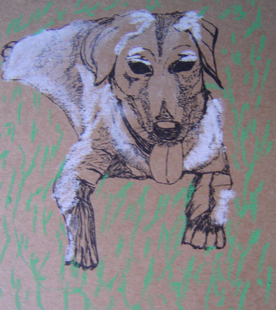
Juliet, from a photo 4.2.06 Posted by Picasa

This is a drawing of my parents' labrador, Juliet. They live in Thailand, hence the drawing is from a photo. Done in ink and pastel. I'm afraid I didn't capture the sweetness of her eyes. Or, another way of putting it could be...have I just made Juliet look like a freaky ghost dog?

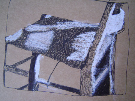
A Chair for Illustration Friday


Chair in shadow and light, 4.2.06 Posted by Picasa
Ink, pastel and marker

Portrait of Barney, by Mad


Portrait of Barney by Mad Posted by Picasa

This is the picture drawn by my friend Mad at the same time I drew a picture of Barney (see Barney at Mad's). Although we were drawing the same subject, we came out with totally different pictures, which I love. She used oil pastels and I used soft pastels. I actually like her version of Barney better.

Wednesday, February 01, 2006

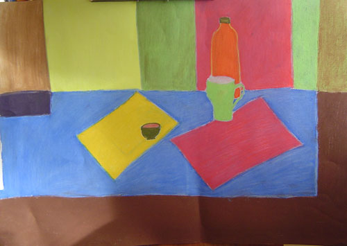
Still life with blocks of colour, pastel 7.11.05


My first picture for my drawing in colour course. Posted by Picasa

I didn't like this picture. In my notes to my tutor I said I didn't like it because it didn't look right. Because my aim (and the objectives laid out in the assignment) were to try to describe what I was seeing as accurately as possible, I didn't feel the flatness of it was accurate, nor the tones of the colour of the objects or the blocks. However, my tutor's comments surprised me. It seems I am learning more from the drawings I thought were crap and didn't like than the ones that I did. For a start, it never even occurred to me to think in any other way than trying to describe what I saw accurately. Seems a bit obvious now, but as a beginner, I thought that to try to achieve accuracy or a good likeness was enough to aim for. In any case, it's given me a lot to explore and think about, especially what artists try to express / convey / achieve in their art. Any comments, books, artworks, articles, drawing experiments to try that might help me in my exploration would be most appreciated.

My tutor's comments: You commented that you were not pleased with this drawing because it appeared too flat and various things about it were not right. I am always interested in the statement "not right" in reference to a drawing or a work of art because it presupposes an absolute or an ideal of rightness which is potentially different for each artist. It may be useful for you to consider what it means for you for an artwork to be right. To me this drawing makes reference to many other modernist artists for whom the ideal of rightness or particular style was very much bound up in abstract ideas about colour. Artists such as Nicolas de Stijil or Piet Mondrian - particularly Mondrian because of the way that he makes use of the vertical and horizontal as you have here.

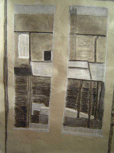
View through the back door - in black & white, 27.11.05


For my drawing in colour course Posted by Picasa

I gave up on this drawing because I was frustrated with the way the light was changing as I drew, and didn't know how to deal with it. I wasn't going to post it because I thought it wasn't a very successful drawing, but my tutor thought otherwise. So I've decided to post both the drawings that I think are successful, and the ones I think aren't, because who knows what I could learn from the comments of others!

My tutor's comments: I liked this drawing because of the way that you used thick black lines to divide areas of tone. I think it is a shame that you gave up on it. Changing light can be extremely frustrating when making a drawing and part of the difficulty, of this exercise in particular, is as much to do with making decisions as to what to make light and dark as it is to do with representing what you see.