Friday, April 14, 2006

Spotted for Illustration Friday


When I asked Paul if I could have something a little more exotic for breakfast, this wasn't exactly what I had in mind. "Hello," the little fella said, introducing himself. "I'm Banjo, and as you can see, I'm a spotted hippopotamus and I caught a lift out of my war-torn country on this banana. If you don't eat me and allow me to live, I will grace your life with laughter and song forevermore," he said.

I reassured Banjo that he would be quite safe in OUR house, and there you have it! Another addition to the family. He got even more excited when I explained about Illustration Friday and insisted on posing for me.

Pencil and marker pens. 14.4.06Posted by Picasa

Start of a new sketchbook


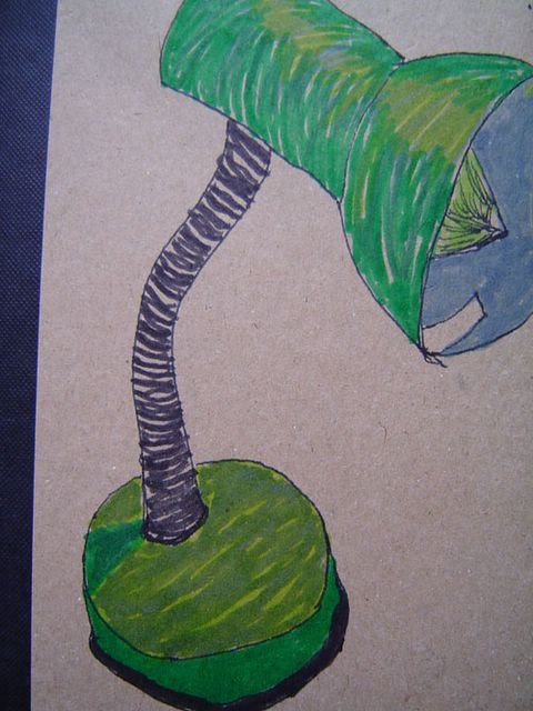
The green lamp sketchbook, an experiment with ink drawings on craft paper. 14.4.06 Posted by Picasa

Wednesday, April 12, 2006

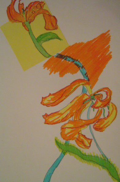
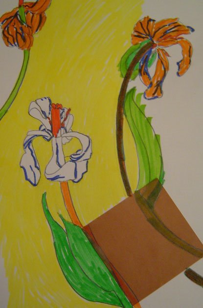
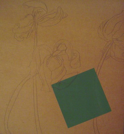
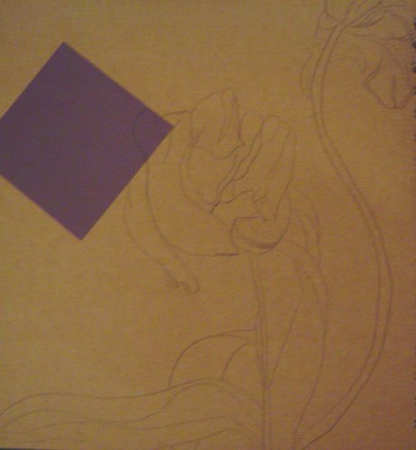
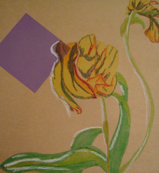
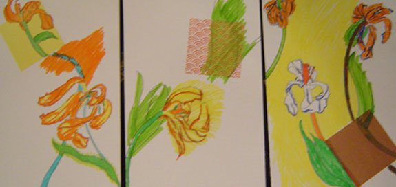
Tulip Tryptich, or I get a lot of mileage out of dying flowers


This is me being fascinated with the shapes of dying flowers, and still inspired by the idea of doing a series of works. So I decided to push myself beyond the urge to make a bunch of pretty pictures, which could have been easy, as my plain pencil drawings of the flowers were interesting enough I think, but I couldn't resist the urge to add colour to them. Perhaps I will do a few pencil ones and just leave them be.

If I was trying to be arty-farty, I would call this sex-love-death, especially as the details of the petals and parts of the stamen were looking quite sexual to me, but I try to resist arty-fartiness. It's bad enough that I've used the word tryptich.

Pencil, squares of origami paper and marker pens. 12.4.06

Sunday, April 09, 2006

Speed 2 for Illo Fri: Fast Friends


For those of you who remember Sydney, and/or are familiar with Mae, who can be found at www.maethebear.blogspot.com or have come across her rabbit relocation programme, (see www.rabbitrelocation.blogspot.com ) you will have been introduced to Cinnamon.

For those of you who haven't, Cinnamon came to live with me on Friday. Sydney is of course the telepathic chameleon space horse I adopted and whose portrait I drew for Illo Friday's monster topic. It just so happens that Cinnamon and Sydney are getting on like a house on fire, and have become fast friends. Cinnamon is very quiet, but as Sydney is telepathic, this is a bonus rather than a problem. Sydney never was that keen on noise. Notice the joyful warm glow that exudes from them as they bask in each other's company. Ahhhh.

Illo Friday Speed, or Mad on the wheel


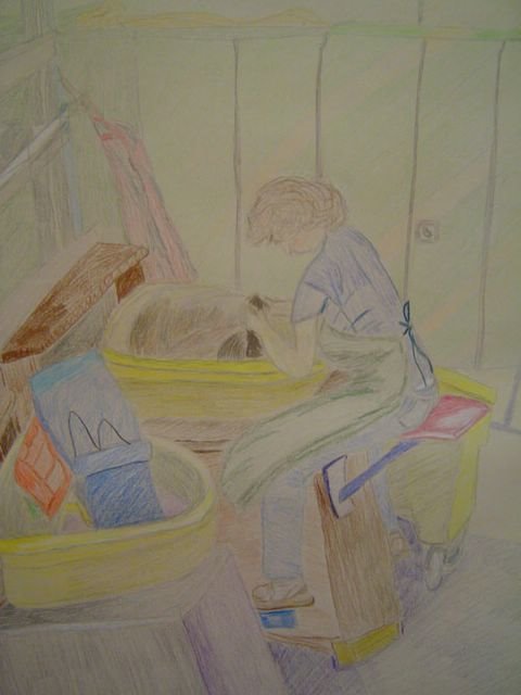
This is my friend Mad on the wheel at a pottery studio. It doesn't look it (cos my drawing is crap), but she can work a gorgeous pot up at great speed in very little time. Hence this also goes nicely with this week's Illustration Friday challenge. It was, however, drawn for my course, the objective being to draw a working figure. I personally don't like what I have done, I don't think I have achieved a sense of life or movement here at all. While I was colouring it in, I wished I was using pastels instead, but the project was to work with coloured pencils. Also, I didn't have time to finish it in one go, so this was done in two sittings, and I had to finish it off from memory. 8th & 9th April 2006 Posted by Picasa

Thursday, April 06, 2006

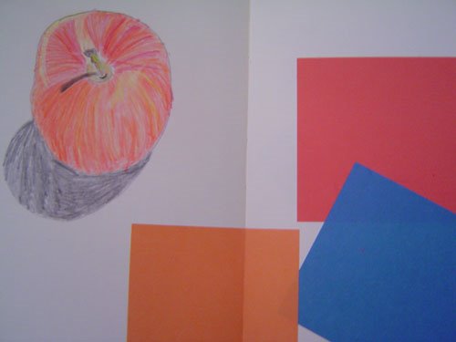
From my journal, apple with squares of colour


On Monday, I turned to the next pages in my journal and it had these squares of colour on them. I was about to draw an apple and I thought they fit quite nicely together! Coloured pencil, squares of origami paper, pre-glued into journal. 3.4.06 Posted by Picasa

Wednesday, April 05, 2006

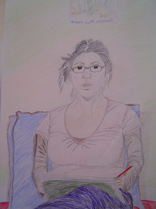
Self-portrait with decorative flower drawing, in coloured pencil

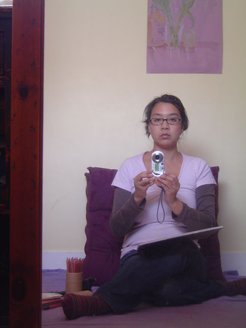
This is another project for my drawing in colour course. The idea is to draw a working figure. I'm going to be drawing my friend Mad throwing on the wheel in a pottery studio this weekend, but wanted to get a warm-up drawing a person from life, so I did this self-portrait.

This is me about to get started. The picture on the wall above my head is my Orange Tulips drawing (previously posted). I included this in the self-portrait, hence the title of this post. "Decorative" of course because I'm sure when I submit it to my tutor he will probably say it is merely decorative. It doesn't stop me from liking it and finding value in it anyway. I still think it's a good drawing. If you're interested in my current conundrum with my tutor's comments, see post below "How does an artist develop their own style?"

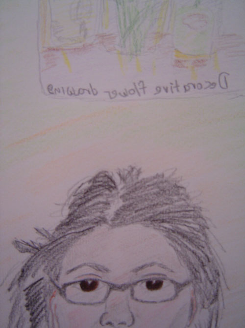
Anyway, here's the finished self-portrait, along with detail. The backwards writing reads "Decorative flower drawing", ha ha ha hahahaha. This is only the third time I've attempted to draw myself from life. I know I haven't succeeded in conveying a sense of movement. For a working figure, I look a bit stiff and wooden. But still, there are things about this drawing that I do like (I think the face looks more natural for example), and lots that can be improved on (like the proportions of the rest of my body - I am aware I've given myself really big knockers. It's not wishful thinking, I promise).


Thanks for looking (at the drawings, not my knockers).
Pencil & coloured pencil. 5.4.06

Tuesday, April 04, 2006

Updated 9th April: How does an artist develop their own style?

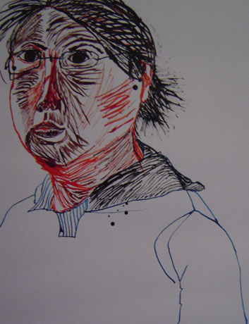
I'm in a bit of a conundrum. I received some feedback today from my Drawing in Colour course tutor for my second assignment. This relates to the two self-portraits, the drawing of my friend in my living room, my drawing of Maria Luisa Parque and the Seville Townscape.

This is what he had to say:

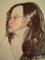
I think that your two self-portraits using pen and ink are the two most interesting drawings here. It is their uncertainty that I like, they seem to me to have an intense engagement with the subject, a searching for the self in external appearances, that is perhaps most evident in self-portraiture.
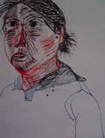
I can see why you like your other work more, it is easier, it is less revealing, it risks less.

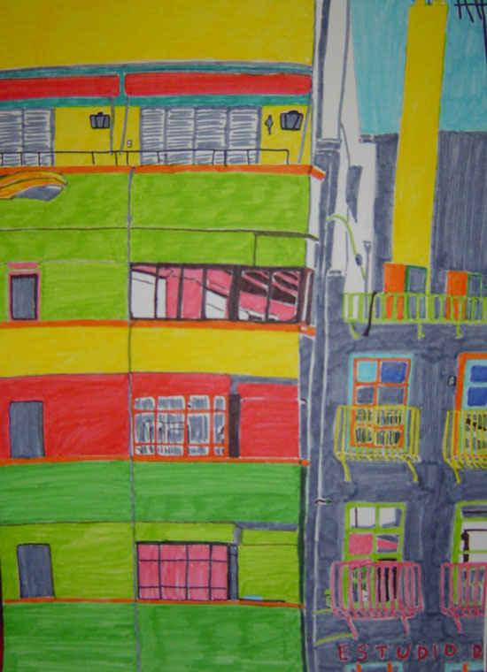
(Note: he's referring to my Seville Townscape, and to set the record straight, I didn't say I liked it more, I said I found the townscape project more inspiring than doing the park drawing (see bottom), and that I found working with pen and ink for the self-portraits a lot more difficult, which is not the same as saying I liked this drawing more).

This work seems to me to be very stylised in a way that I would describe as decorative. It has a strong emphasis on surface, pattern and an inventive, and largely subjective, use of colour.

To what extent is this decorative style determined by the limitations of the media you are working with?

(Note: I hadn't thought about that, but he's right, it was entirely affected by the fact that I was using marker pens. If it been a pastel drawing, I would have stuck to the original colours of the actual scene. I don't know if it would have made a more revealing drawing though.)

To what extent do you consider it to be your own?

(I don't even know what my style is, I say more on this below. However, I wasn't aware of trying to copy any particular style as I was drawing this.)
It is a style that reminds me of the work of David Hockney, Henry Matisse, Friedensreich Hundertwasser and Gustave Klimt, among others. These are all artists you will probably enjoy looking at if you are not already familiar with them. However this decadent enjoyment of surface is only one aspect of art and leaves much unexamined.

My overall response: Huh? Has my drawing just been dissed? Even so, I guess I'm in good company! Joking aside, I think I know what he means, but it's a little above my head, and very far in the future in terms of my development. I have no idea what my own style is, and part of me doesn't even like the idea of having a style that is so predictable it can be called mine, as if it would be something fixed and never change. Also, I really have no idea how to go about going beyond the surface as he says. All that I try to do with any drawing I attempt is to interpret as accurately as possible what I am looking at, on paper. I don't go beyond that just now, and I don't think about how to make it Art with a capital A, or a certain type of Art. This is what happened when I was writing and I got so hung up about producing work that was going to "wow" people, and therefore had to be whatever was "wow" or trendy at that time, that I lost any sense of why I was writing in the first place. It stopped being about my own process and became a way of trying to please other people. Yes, I do want to be challenged, I do want to learn, but I don't want to start thinking that I need to be changing my work to make it into something particular, whatever that may be, as I fear that may inhibit the process I'm already going through naturally in my development. Does this make sense? Have other artists out there experienced a similar process? Any thoughts out there by anyone would be most appreciated.

He goes on to say: I like the way you have used an olive green in your drawing of a park against a yellow to represent light and shadow.
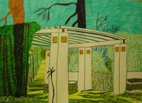
I like the way that you are beginning to think of colour tonally here and consider them not on their own but in relation to one another. For me this begins to open up the possibility of a more sensitive way of working with colour. It seems that with the introduction of this olive green against the yellow there is the beginning of a more spatial awareness of colour, using colour to represent light and to describe form and space in the way that Paul Cezanne or (early) Matisse might use colour.

My response: I didn't know I was doing that, is it helpful to have it pointed out? Not sure yet. Will it create an expectation and influence the way I work in future, in a positive way? Don't know. I guess we'll just have to wait and see how things develop. 4.4.06

* * * * * * * * *New bit...added 9th April, 2006 * * * * * * * *

For those of you who might be interested, I wrote back to my tutor asking for clarification on his comments, cos they just kind of confused me. I also explained that all I'm trying to do and feel able to do right now is to translate as accurately as possible what I see onto paper, and that although I know there is something more to work towards, I wasn't quite ready or even able to articulate yet what that might be. Here is his reply.

"For me, while attempting to “ translate what I can see before me as accurately as I can” (as you put it) is a useful skill in drawing, that “something more” that you speak of is where drawing becomes art. While we could talk about what this something more is endlessly I would suggest that this is perhaps the job of the philosopher and not the artist, and the best way we can find it as artists is through the practice of drawing itself. And without first having something, such as translating what you can see before you as accurately as you can, it is impossible to have something more.

In my comments I suggested two practical things that you can do to inform your practice. Firstly looking at the work of other artists. In doing this I have classified two kinds of artists, the “decorative” ones that deal with surface and those that deal with depth and form. You may or may not agree with this classification. My opinion is that this second way, that which deals with depth and form, is a good way forward for you because I think it will help you more to translate what you can see before you as accurately as you can.

Secondly I have given you a practical way of achieving this by using an example in your work (the olive green and yellow). I am suggesting a more tonal use of colour and you can see this in the work of the artists I have suggested. If you are interested you can read Johannes Itten's The Elements of Colour and Jack D Flam's Matisse on Art both of which will describe this in more depth. Basically try to think about a colour not as an isolated thing by itself but in terms of the relationship between it and other colours.

Drawing can be very confusing if you think about it too much, the best thing is to just get on with it and then it will become clearer through doing it."

I thought this was much clearer and told him so. However, my brain is buzzing and overflowing after thinking about all of this. Will try to calm down and just carry on drawing. In the meantime, I hope that some space clears up in my head eventually so I can take this new information in. I am quite excited about looking at the work of Matisse and Cezanne too. Will keep you posted. 9.4.06

Monday, April 03, 2006

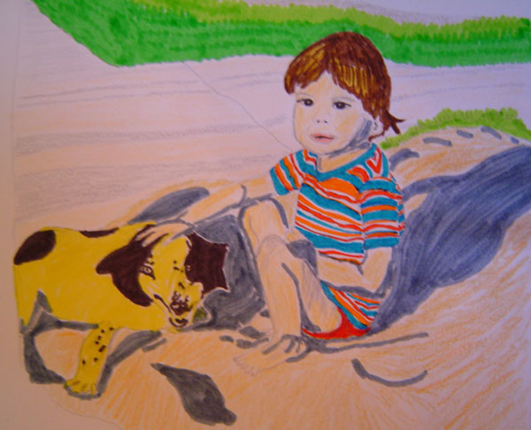
Happy Birthday Tony!


This was drawn from an old photo of my little brother when he was about 3 years old, playing in the sandpit outside our house in Thailand. The dog was my Mom's best friend's dog, who lived across the road from us. A sweet little fella who died when we were heading for our teens.

For Tony's birthday, (which is actually April 4th), who now lives on a whole other continent. Pencil and marker pens, 25.3.06
Posted by Picasa

Sunday, April 02, 2006

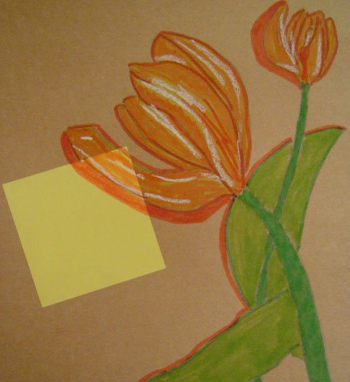
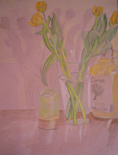
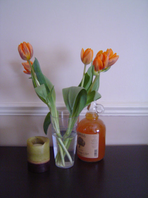
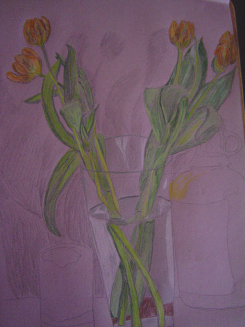
Orange Tulips


This was done for my drawing in colour course. The assignment was to draw flowers and relate it to its surroundings. I really enjoyed this, coloured pencils are lovely and versatile and easier to control than marker pens. This also happens to coincide nicely with the Illustration Friday theme of Spring! If you want to see how this picture unfolded, see the art recipe below. Drawn on A2 sized sugar paper in coloured pencils. 2.4.06 Posted by Picasa
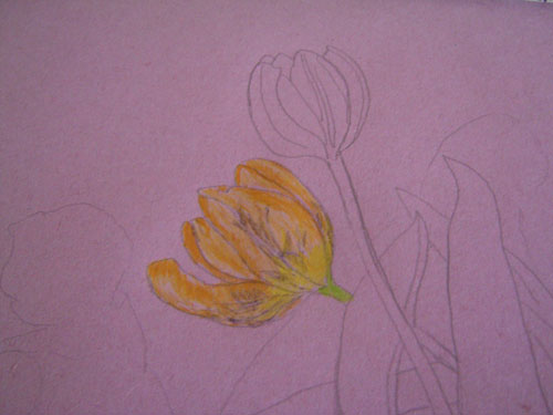
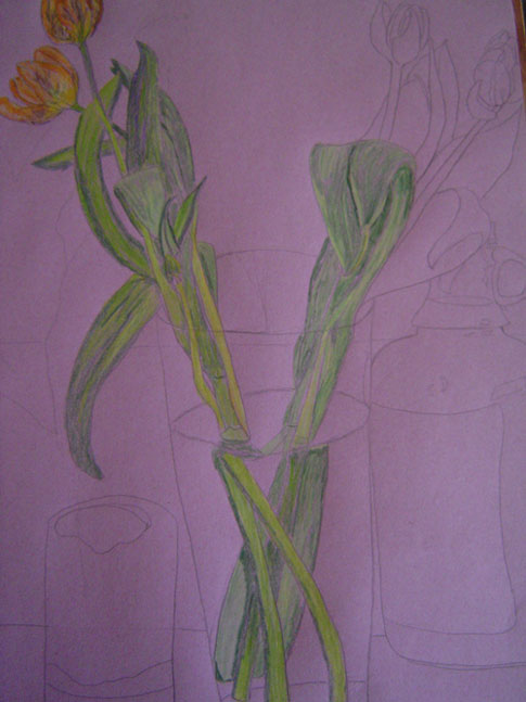
Art recipe for Orange Tulips

1. Choose and set up your subject. The assignment was to draw flowers. My friend Mad happened to give me some orange tulips yesterday, the perfect subject!!


2. Do a contour drawing in pencil. I decided to work on coloured paper to make it a bit more interesting. It's A2 sized, sugar paper.


3. Start to add the colour gradually. It's a long process, and there's no other way to do it apart from taking it step by step, paying attention to tone and shade.


4. Add background shadows and lighter tones from reflections before the light fades away!


6. Finish colouring in, add foreground colour and finishing touches. Here I decided to colour the upper part of the drawing around the shadows a light yellow, to give some contrast. Here's the finished drawing. The whole process took about 3.5 hours.

Monochromatic for Inspire Me Thursday


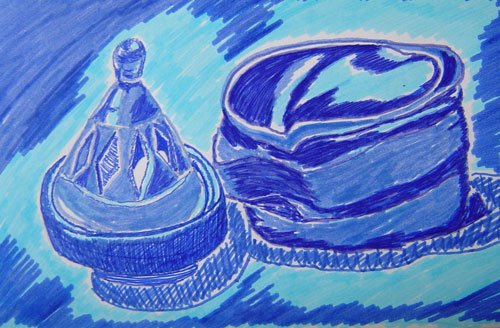
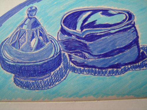
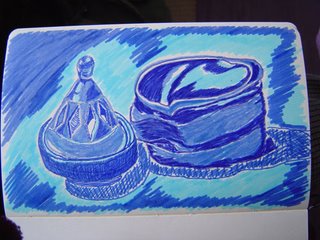
This week's Inspire Me Thursday www.inspiremethursday.blogspot.com theme is Monochromatic. Hopefully this isn't too late. It was a bit rushed, but here you go. Still life in blue, in pencil and marker pens. 2.4.06

If you want to see how I did this, have a look at my art recipe below.
Thanks for looking. Comments are appreciated! Posted by Picasa

Art recipe for Still life in blue

I was asked to join an "Art Recipes" group on flickr (see link to my flickr gallery on the right), where you document your process for creating a piece of art. Here's my first attempt! This is the process for my Still life in blue (finished piece above) for the latest Inspire Me Thursday challenge: Monochromatic. Don't worry about all the art-related acronyms happening on different days...just read on and stay with me!

1) Choose your subject and your materials.

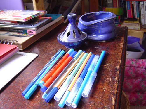
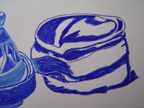
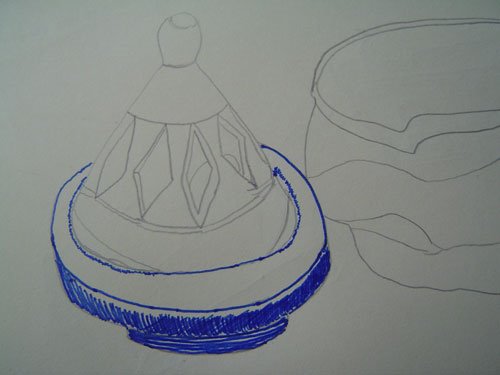
To do this piece I wanted to pick something fairly simple. I had this incense holder and my first ever pot made on the wheel to hand. They happened to be similar shades of blue so I put them together. The colour of the objects chose my monochrome colour and shade for me. I decided to do this in marker pens as I wanted the colours to come out quite vividly and intensely. This was drawn in my moleskine journal.


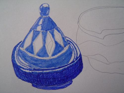
2. Start with an unobtrusive contour sketch, here I've used pencil. Try to follow the contours of the objects.


3. Observe the way the colours look on your subject. Start to shade in the darker areas first. I started the shading in by using a fine-nibbed marker in dark blue.


4. Keep looking at your subject as you colour in, pay attention to where shadows might be. As I was doing this, I realised I'd made a mistake in my drawing. I'd given the lip of the incense holder an extra layer, so I corrected it by colouring over my lines. The mistake means that the perspective of the object is now slightly off, but as I've learned before, this doesn't necessarily matter. Just keep going! I used some cross-hatching to get a darker shade effect.


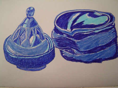
5. Carry on colouring in the object, referring to the subject, and taking care to leave areas of light reflected on the object blank. I swapped to a broad marker pen to do this colouring in as the shade was slightly lighter. Unfortunately, I got carried away with the colouring in and neglected to do this, as you can see below. I only realised when I got to the upper part of the lid and remembered to leave some bits blank there.


6. Start shading in the second object. Again, start by shading in darker areas first. I did this in three stages. First with the broad marker pen to mark the areas I thought were darkest. Then I went over those areas again, once with the fine-nibbed pen making loose lines fairly freely over the shaded areas, and then again with a medium-nibbed marker to smooth out any edges.


7. Colour in the rest of the areas, keeping them lighter in shade. Remember to keep referring to the object and observing where and how the light falls on it. Here I filled in the medium light tones with a light blue marker pen, leaving the very lightest tones blank.


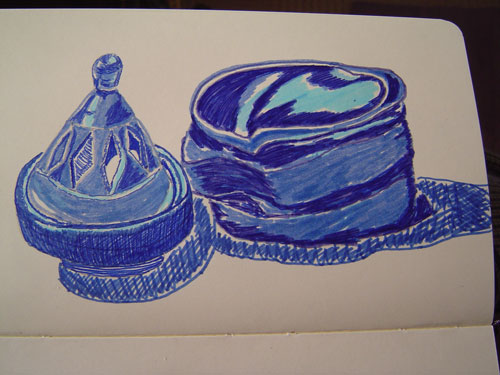
8. Nearly there! Take a look at what you've done. Do you like the overall effect? Is it finished or does it need something more? I felt it needed something more. I tend to like to fill my entire page with colour, so I decided to add some shadow around the objects. I used cross hatching with a fine-nibbed marker again here to make the shadows look darker than the blue on the objects.


9. Take another look. It still didn't feel finished to me, so I filled the page with colour, using the shadows around the objects as a rough guide as to where to put my colours.


10. Finish up! Take a final look. Add finishing touches. Give it a name, and voila, there you have your Still life in blue. Date and initial your work, photograph and post to blogger!

Playing with coloured pencils

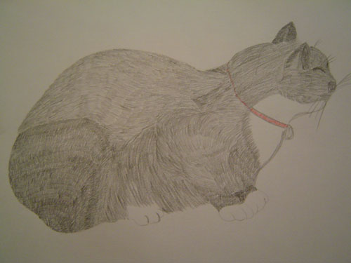
I'm now starting the coloured pencils section of my drawing in colour course. To get a feel for them, I did these last night.

Caesar managed to stay still for a few minutes so I just about captured his contours. It was fun playing with the different shadings for his fur.

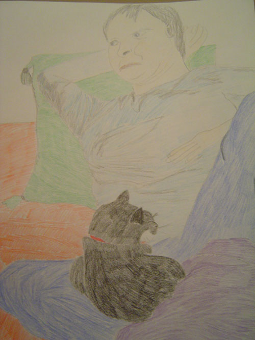
Then he went and sat on Paul so I did another quick sketch, below.


What I realised is that I need to layer or build up the colours a lot more when using coloured pencils, as they come out fairly faint otherwise. This is the first time I've tried to draw Paul from life since December or January...I just gotta keep trying!