Tuesday, January 31, 2006

Barney at Mad's, in pastel 14.1.06


Barney at Mad's, in pastel 14.1.06 Posted by Picasa

Another drawing that might be called sentimental? (See comments for bear, hip flask and fruit). Is it because of the subject? How can a drawing of a beloved object be done in a way that wouldn't be sentimental? Comments please.

Caesar helps me with my self-portrait 29.1.06 Posted by Picasa

A view of St Ives, in pastel


A view of St Ives, in pastel. Drawn for Sarah, 27.1.06 Posted by Picasa

Portrait of Paul, in pastel 21.1.06


My first attempt at drawing a person (yikes!), Paul in pastel. From a photo, 21.1.06 Posted by Picasa

view through a door, pastel 18.1.06


Last picture in the pastels section of my drawing in colour course Posted by Picasa

My tutor's comments: Yes, the door is obviously a bit out but I like the way you have used a cultured ground in this picture. I also particularly like the lampshade, which I think owes its success to the fact that it is yellow. Yellow being complementary to the purple ground of the picture gives the effect of making it stand out. This particular complementary contrast of yellow and purple has the property of also making the most contrast of tone, which also has the effect of making the yellow appear to glow against the background.

Bear, hip flask and fruit, pastel 31.12.05


Another one for my drawing in colour course Posted by Picasa

My tutor's comments: To be brutally honest I didn't much like this one. You don't need to be dismayed by this because I think your other work redeems it. I think this drawing suffers from being picturesque, nostalgic and sentimental, and working with pastels, it is all too easy to cross this fatal line. Picturesque means simply that it appeals to commonly held notions of what a beautiful picture consists of. It has been said that in the post modern era, it is no longer possible to make art that is beautiful or that appeals to notions of beauty without its becoming kitsch. There are elements in this drawing such as the reflection in the flask that show an engagement in looking but on the whole this one seems contrived from an idea of what a picture might be.

My response: I know it's twee, I knew it as soon as I picked the bear and a pink box to be part of the drawing. And it probably shows that I didn't think much about why I chose them. But I truly enjoyed and was happy with my ability to describe the proportions and colour tones of the bear and it's reflection in the hip flask. That's what I was mostly aiming for. I have also been aware that even though I like this drawing, there is a part of me that cringes inside to show it to people. The responses have been mixed, and some people do seem to like it. Nevertheless, I have shown it, as it's been part of my drawing process. And again, it's given me a lot to think about in terms of beauty and what a good drawing "should be".

Lemon up close Posted by Picasa

Tomato up close


Tomato up close Posted by Picasa

lemon tomato pepper, pastel 31.12.05


For my drawing in colour course Posted by Picasa

My tutor's comments: I really liked this drawing. I think you have been very successful in getting the different textures. Maybe when a drawing "works" there is not much to be said?

Poinsettia in window, pastel 28.12.05


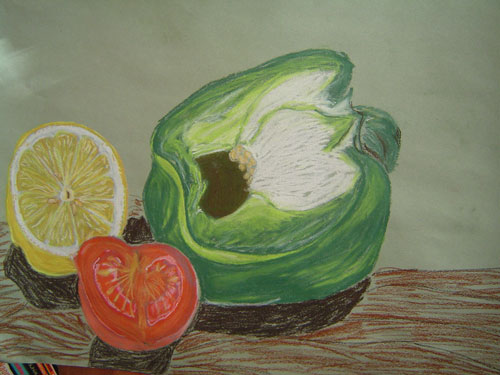
For my OCA drawing in colour course Posted by Picasa

My tutor's comments: 
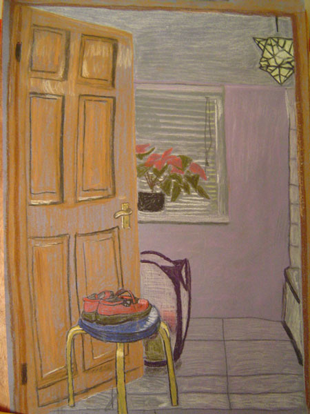
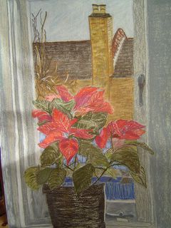
It shows that you enjoyed this drawing. I like the way that the red and the green of the plant really seem to come forward against the mass of grey around it. But then I think that this is confused a bit by the blue, which also seems to want to poke through the gaps in the leaves. The grey seems to recede against the colours outside. If you look closely at that grey you could probably find other colours in it that might draw it forward.

Here you have set up a picture with a foreground, a middle ground and a background; the plant, the wall and the outside. This is clear in the drawing but I think your use of colour doesn't quite fit the drawing. However just engaging in pushing and pulling colours around in space in this way is itself quite an achievemnt and if you can see what you are doing here and develop it then you have made a very good start.

The language of areas of colours coming forward and receding is a very modernist one based on the ideal of creating a pure and harmonious composition from colour, it comes from artists like Cezanne who famously talked about "recording coloured sensations", Matisse and even Hans Hoffman, an American abstract expressionist who talks in terms of "pushing and pulling" colours. I think it would be useful for you to have a look at these artists if you are not already familiar with them and see if you can see what I am talking about.

Caesar sketch in willow charcoal


Caesar sketch in willow charcoal 8.1.06
From a photo Posted by Picasa